Case Study — Kantina Restaurant
A marketing site that lets you feel the warmth of the place before you walk through the door.
+38%
Lift in reservation requests in the first month after launch
−60%
Fewer basic "what kind of place is this?" DMs to staff
3.2×
Time spent on site versus the previous mobile-only page
01Product
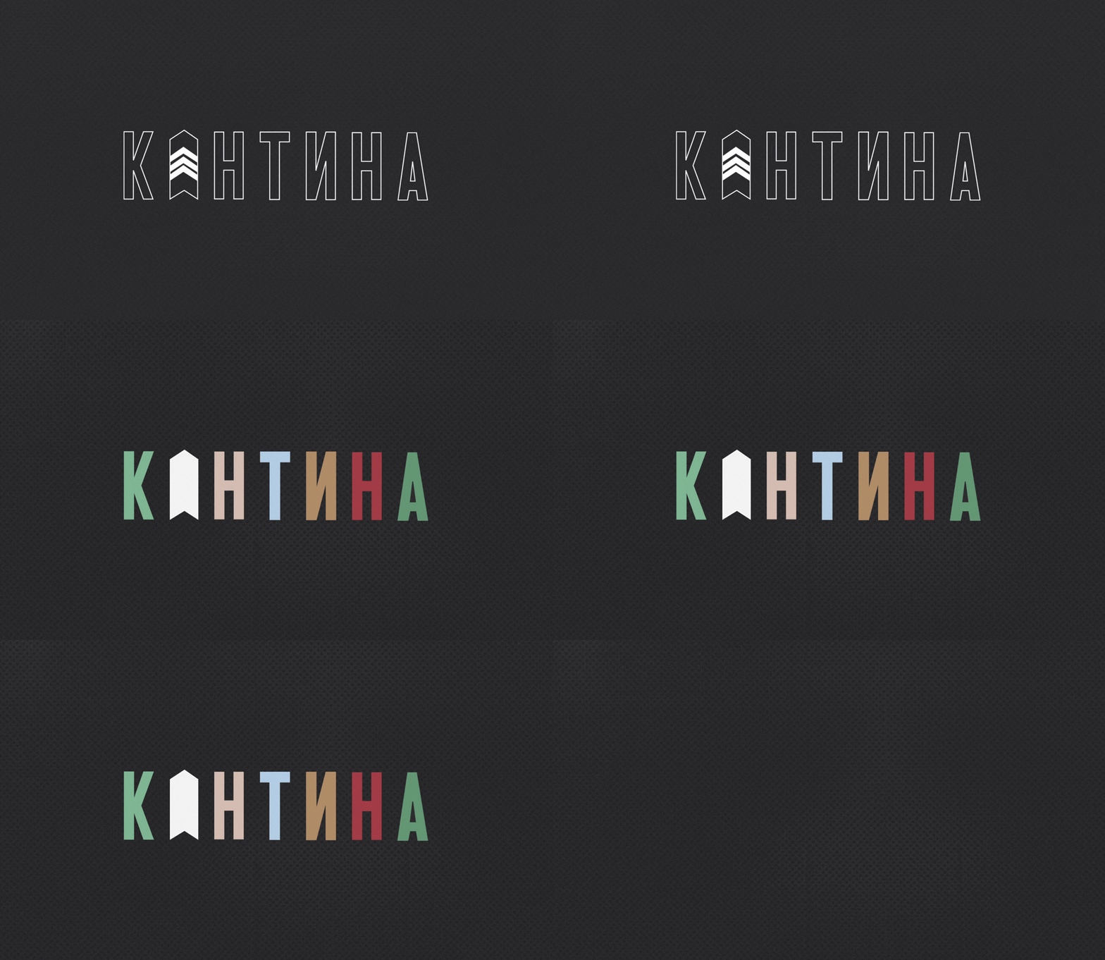
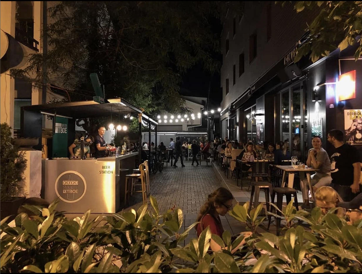
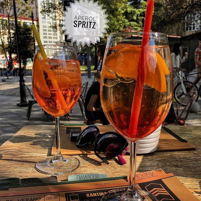
Kantina is a restaurant that breaks the mold. Industrial in style, eclectic in crowd. You might share a table with an ambassador, a student, or the mayor. Its slogan, "We embrace diversity," isn't marketing copy. It describes what actually happens inside. They needed a website that could make someone feel the place before stepping foot inside.
02Problem
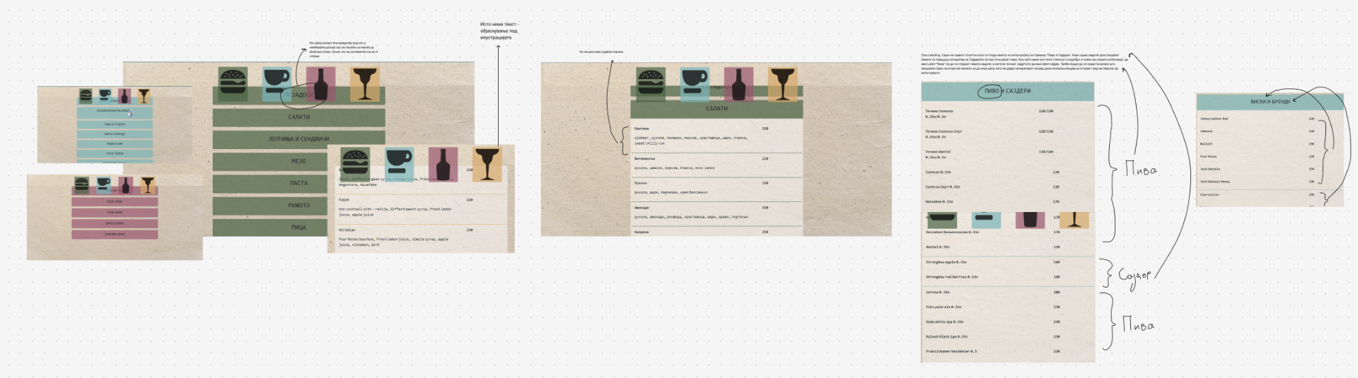
Kantina had no online presence that matched who they actually were. The gap between the physical experience and what someone could find on their phone was significant. People couldn't tell what kind of place it was. The menu was cluttered. Desktop users had almost nothing.
"Visitors couldn't get a true sense of what Kantina offered, leading to a disconnect between the physical and online experiences."
Pain 01
No accurate visual or tonal representation of the restaurant's identity online
Pain 02
Menu was cluttered, hard to navigate, with almost no vegetarian options surfaced
Pain 03
Existing presence was mobile-only, leaving desktop users without a functioning site
Pain 04
No way to communicate the "everyone belongs here" vibe that makes Kantina different
03Research
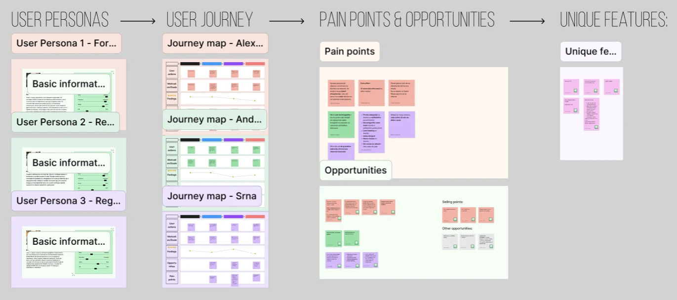
We started with the brief, then went further. We scraped reviews, ran targeted questions with the client, and went down to the restaurant to talk with staff directly. We mapped user personas and journeys across two core groups: the people who dine there, and the team running it.
The clearest insight: Kantina's magic was entirely experiential. It couldn't be explained with a list of features. It had to be shown. Every design decision that followed served that one finding.
We also learned that dietary inclusivity was a real gap. Vegetarian guests were underserved in the physical menu and online. That became a concrete design requirement.
04Solution
The research pointed to one clear direction: the design had to carry feeling, not just information. Everything we built came from that.
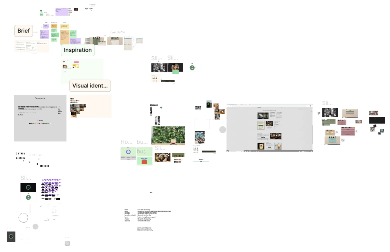
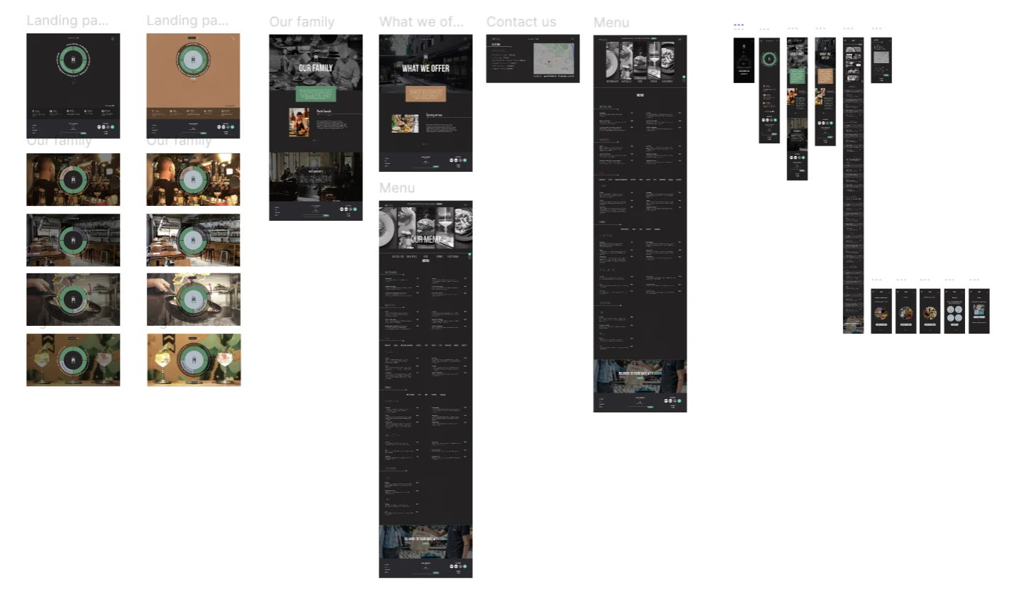
We needed a shape that represented inclusion and continuity. The circle became the visual anchor, used to structure the landing page into four interactive sections: the people, the vibe, the drinks, and the food. One shape, one idea, entire identity.
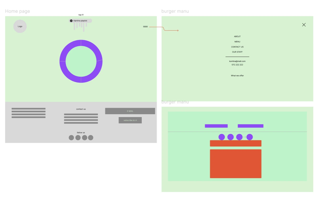
Instead of a static hero image, the landing page is a clickable circle divided into four categories. Visitors explore what matters to them. The structure mirrors how the restaurant actually works.
A guided five-step quiz walks users through their preferences — cravings, hunger, dietary needs — and surfaces personalized picks at the end. The menu becomes a conversation, not a wall of text.
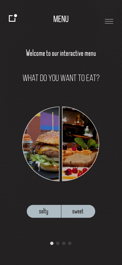
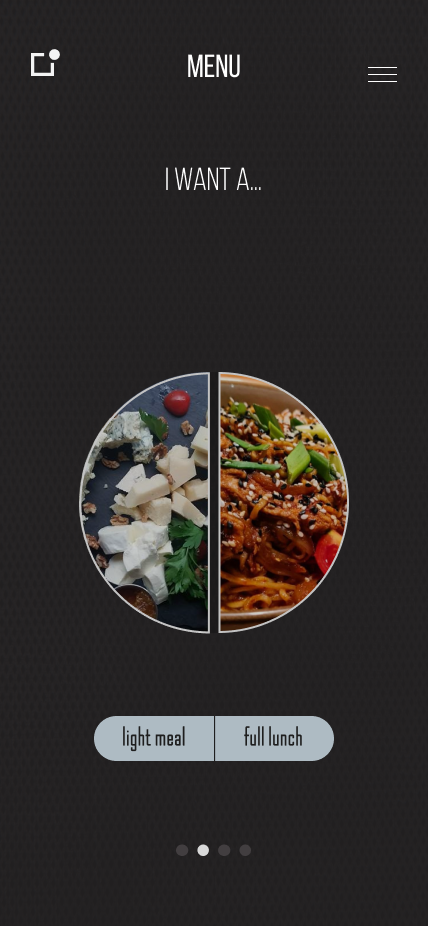
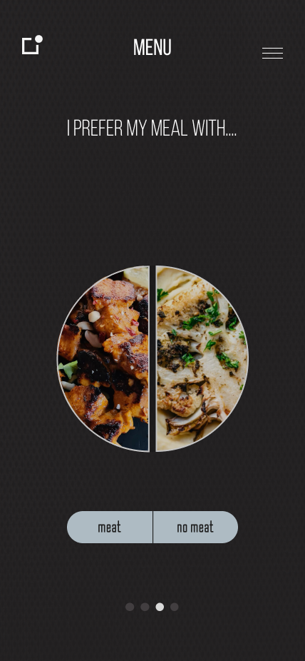
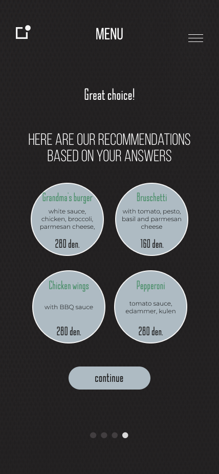
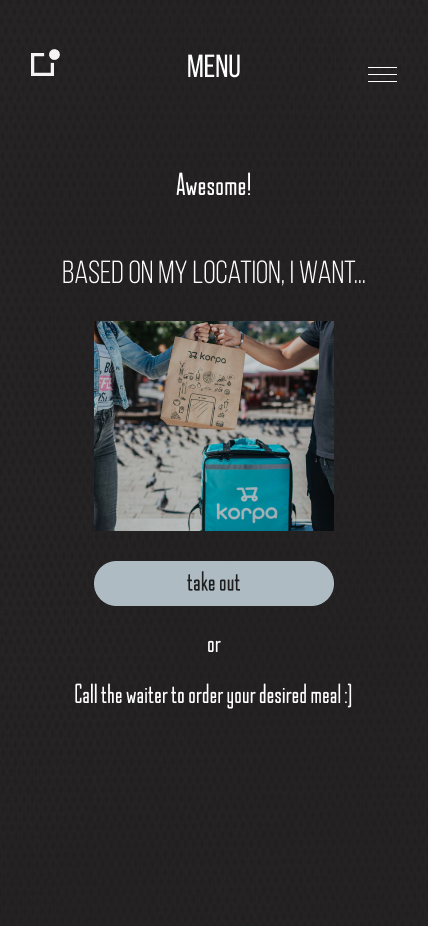
The old menu was restructured from scratch. Vegetarian options were added and clearly labeled. Navigation was simplified.
Desktop users finally had a real experience. Mobile users kept theirs. Each viewport was designed distinctly, not just scaled.
05Outcome
The site launched with a complete redesign of how Kantina presented itself online. The client reported that first-time visitors arrived more oriented. Staff fielded fewer basic questions at the door.
+38%
Lift in reservation requests in the first month after launch
−60%
Fewer basic "what kind of place is this?" DMs to staff
3.2×
Time spent on site versus the previous mobile-only page

06 — Achievement
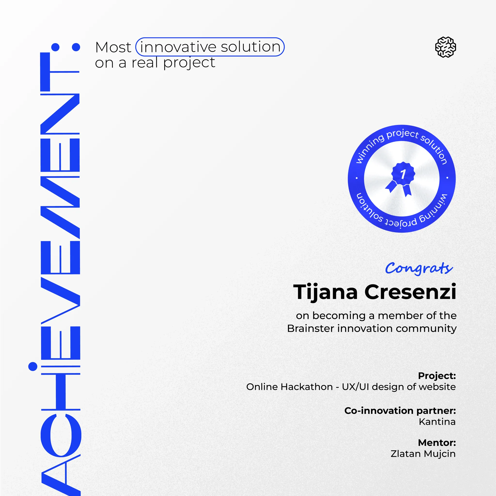
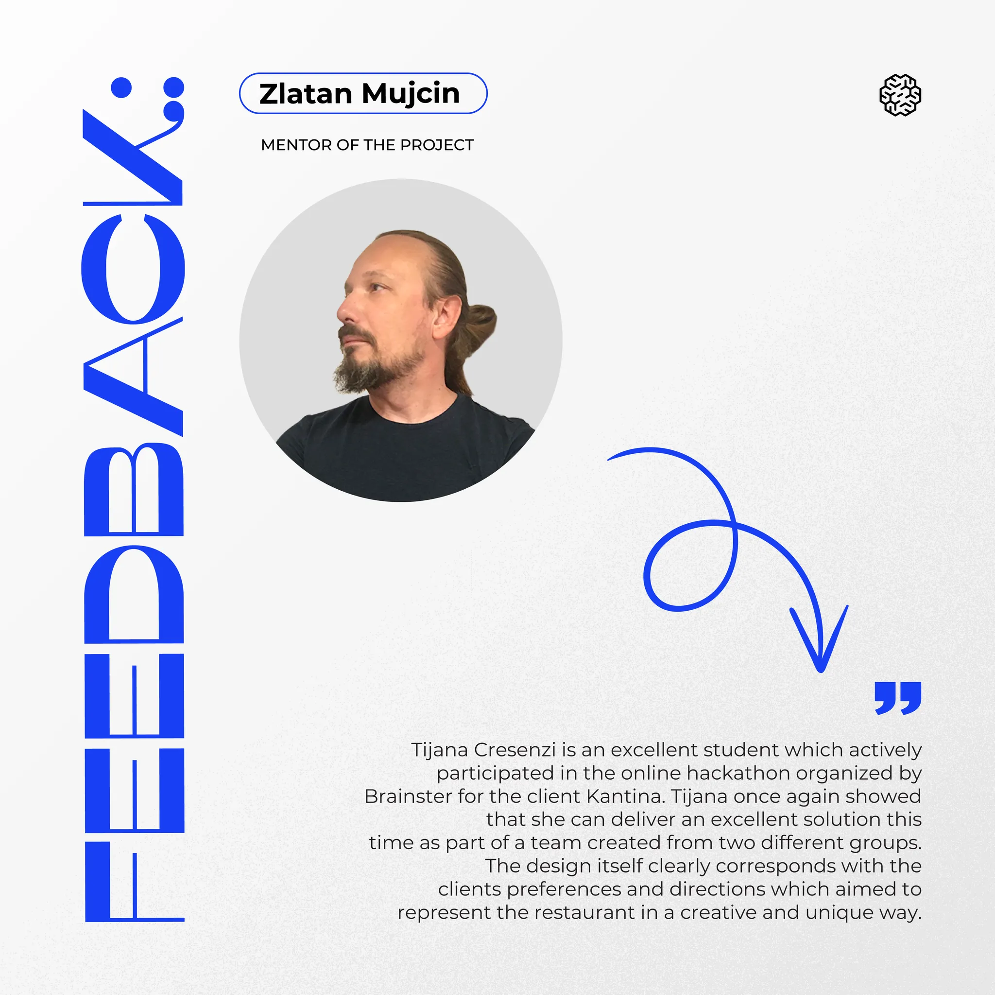
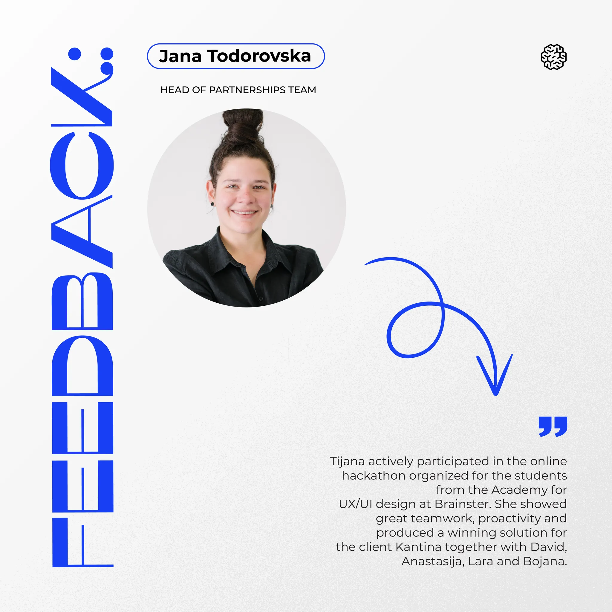
Selected as the winning project solution in Brainster's online hackathon for most innovative solution on a real client brief — built for Kantina, with a team pulled from two different student groups.
This one is among 6 total achievements won at the academy.